Wednesday, 23 September 2015
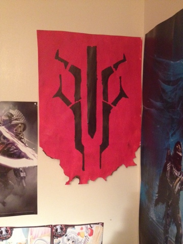
Destiny: banner
I wanted to recreat a banner found in the game destiny. I created a stencil with the use of a projector to get the scale. I sponged on the background and finger painted the stencil on. The result I got was what I wanted. As I wanted a worn war time look. I then burnt the bottom to give it more of a old worn look, like it can be found in game
Tuesday, 22 September 2015
22/9/15: Researching Dada
learnt about some of the first people to do the dada movement. The inervators of the movement, for example Duchamp and The Baroness Elsa (https://mitpress.mit.edu/books/baroness-elsa). i found that Duchamp enjoyed to make a joke, the lhooq, the fountain and also his alter ego Rrosy Selavy. Which was a pun that roughly translates as "love, thats life". i started to look into how dada as a text format and what that in tales.
Monday, 21 September 2015
18/9/25: first session of life drawing
Spent 3 hours doing life drawing, at the moment we don't have a mods el. so we been drawing skeletons. I personally enjoy drawing skeletons due to the shape and the shadows that form. I found thought out my work that I was improving but found that as I getting closer to the 3 hour mark my work was starting to lax. This was because I was tired and my legs were starting to buckle. During my I first session I felt learn some tips to help me.
Wednesday, 16 September 2015
16/9/15: Propaganda Poster Photoshop Session
Took photos of objects to be used to recreate my original idea of a propaganda poster. I learn new skills on using photoshop and created a piece that looks worn and like it was a stencil. In the coming week I shall be printing the poster off to see how it looks up and to get some photos of it screwed up.
Using this as a concept I make a poster in Photoshop. I sadly didn't get much of the middle staged photographed but the final piece.
The images used are my own which I took and the screwed up and flattened look. I achieved by screwing up paper, taking a photo of it and then put it on a layer above everything, before blending it in to get the poster that look.
Subscribe to:
Comments (Atom)


