Monday, 2 November 2015

Salvador Dali

Salvador Dali was a Spanish artist born in  1904, best known for his surrealist work. also know for his surreal films. Dali was a multitalented artist, his work ranged from 2d to 3d, from surrealism to realism, from chotic to harmonized. Dali attended the San Fernado Academy of Fine Art and became internationally recognzed when he showed three of his works at the third annual Carnegie International Exhibition in Pittsburgh in 1928. Included in the three piece was his work intittled "The basket of Bread"

The following year Dali joined the surrealists, soon after became the leader of the Surrealist Movement. But sadly with the approach of the war, Dali had a clash with the surrealists and was expelled from the surrrealists. Dali moved away from surrealist work and went on to doing lots of diffrent medias and wasnt know to not be limited to any particulat style. his works included oils, water colours, drawings, graphics, sculptures, photographs, jewels, films and performance peices. Dali spent the last two years of his life secluded. Dali set the standard of creative artists for the twentieth century. Dali's most well known piece is called "The Persistence of Memory" and unless you live under a rock, you will have seen it.the piece is the classic melting cloaks on a desert landscape.

Friday, 16 October 2015

Life drawing Reseach

I heard that 7 heads equals the hight of a average person, with a bit of research I found it's somewhere between 7-9 I found this handy chart showing it for all the stages till adulthood on proportions 
I continued researching farer and found this site  http://pennycow.blogspot.co.uk/2011/08/matter-of-proportion.html?m=1 
It covers lots about how to get the proportions rights and how to messure.

Thursday, 8 October 2015

Destiny house banner tutorial

LWith the success of making the first Destiny banner I decided I wanted to make a set. With my second banner I made sure to capture each step. 
Step 1. Using a projector, I drew out the stencil
Step 2. I next painted the background to match the image
Step 3. I cut out my stencil, with the detail of the stencil I took me around a hour due to the detail.
Step 4. I attached the stencil to the background using adhesive spray before paint using a sponge.
Step 5. Removed the stencil, I sadly broke the stencil due to puting too much spray. But compared to not using the spray made the print look sharper and have cleaner edges.

Step 6. I burned to get the shape I wanted and folded slightly. This is to give it the finish look of the poster hanging as if it was a banner. This to try and make it look as it is in the game.
This is the finished product. 

25/9/15: life drawing session 2


This session was the time with had a model. It took me some time to find myself, as life drawing was new to me and I didn't like the concept of drawing someone nude. It took me acouple of drawing to get used to it. This reflexes with how my drawings turned out.
On my third drawing we were told to just focus on the model and not look at the paper. This made the drawing look terrible but at the  same time made me more at ease
As when we went back to drawing and looking at both, my drawings improved 
The drawing above is also the first drawing I had done with a 6b pencil. Changing to a 6b made my work look a lot better due to have lightly I draw. 
My last two drawings I liked the most due to size I did them and how making tone looked nicer.
The back of this one I liked the most but I  found I shouldn't start with the legs.
I wish I had more time on my final of the day but I did like how it turned out.

Commissioned to make more Destiny banners

With the success of making the first two destiny banners. I showed my finished piece to my friends and from this I got asked to commission one for him. 
This is the banner of which I was commissioned to make. So following the steps of I posted previously, I made a stencil and sent a photo to my client. 
Other than getting a good response, I also got asked to commission another banner. I got asked to make another banner from the game destiny. So I went in game to get a concept to work with.
With the banner I noticed that there were two that fited the client's request. So I next sent him this photo and asked for which colour sceem the client  wanted. I found the client wanted it to be lack background and white logo. I then followed up with some concept drawings, as my client didn't want this one to have a burned look like my others.
I drew up these ideas of what shape the banner could look like. My client choose number 3, so I drew up the final concept.
Still a very rough concept, but I included a trim to the banner as I thought it might look fancyer. I did so as my client first said he didn't want this one to have a war feel. I sent this concept and got the all clear , so this will be the piece I make for my client. The note my client asked for both banners is that the banners have a painted reverse side so that when they hang you don't see the white side. Personal I don't made it but it's what the client wants so I'm making it that way with a small fee attached.

Wednesday, 23 September 2015

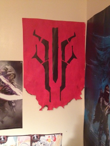
Destiny: banner


I wanted to recreat a banner found in the game destiny. I created a stencil with the use of a projector to get the scale. I sponged on the background and finger painted the stencil on. The result I got was what I wanted. As I wanted a worn war time look. I then burnt the bottom to give it more of a old worn look, like it can be found in game

Tuesday, 22 September 2015

22/9/15: Researching Dada

learnt about some of the first people to do the dada movement. The inervators of the movement, for example Duchamp and The Baroness Elsa (https://mitpress.mit.edu/books/baroness-elsa). i found that Duchamp enjoyed to make a joke, the lhooq, the fountain and also his alter ego Rrosy Selavy. Which was a pun that roughly translates as "love, thats life". i started to look into how dada as a text format and what that in tales.  

Monday, 21 September 2015

18/9/25: first session of life drawing

Spent 3 hours doing life drawing, at the moment we don't have a mods el. so we been drawing skeletons. I personally enjoy drawing  skeletons due to the shape and the shadows that form. I found thought out my work that I was improving but found that as I getting closer to the 3 hour mark my work was starting to lax. This was because I was tired and my legs were starting to buckle. During my I first session I felt learn some tips to help me.


Wednesday, 16 September 2015

16/9/15: Propaganda Poster Photoshop Session

Took photos of objects to be used to recreate my original idea of a propaganda poster. I learn new skills on using photoshop and  created a piece that looks worn and like it was a stencil. In the coming week I shall be printing the poster off to see how it looks up and to get some photos of it screwed up.
Using this as a concept I make a poster in Photoshop. I sadly didn't get much of the middle staged photographed but the final piece.
The images used are my own which I took and the screwed up and flattened look. I achieved by screwing up paper, taking a photo of it and then put it on a layer above everything, before blending it in to get the poster that look.